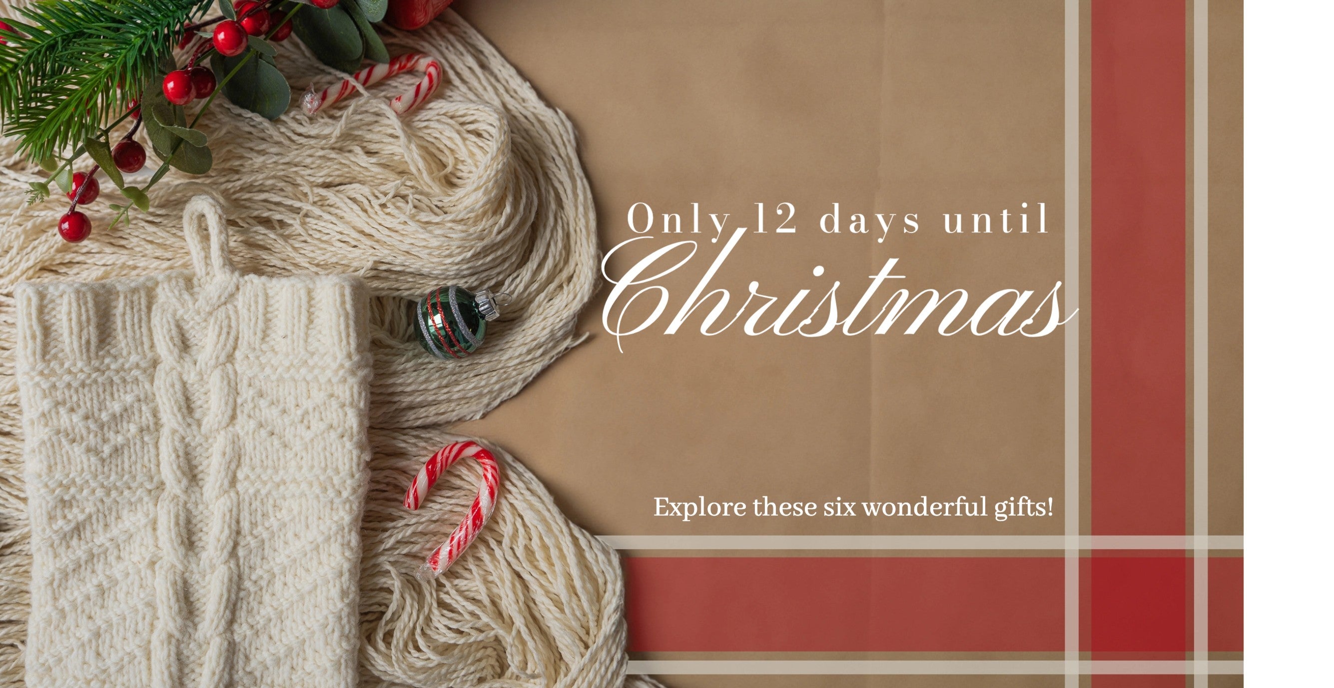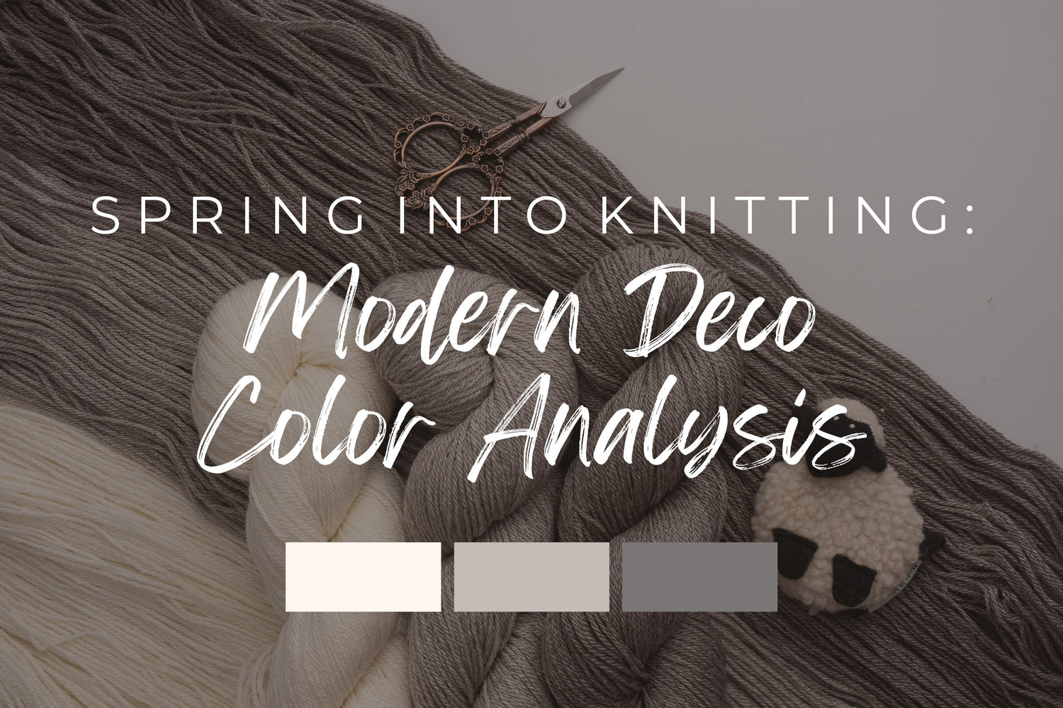

Before we dive into discussing the latest designs featuring Modern Deco, I wanted to take a moment to shake things up a bit. While we'll definitely cover the exciting new samples, I had a spark of inspiration for something different—a seasonal tone palette with Modern Deco shades!
The idea struck me during a recent photoshoot with Jacquie, one of our models and an avid knitter in our community. Amidst outfit discussions, Jacquie shared her experience with color analysis, where friends would gather for sessions determining their seasonal tones—Spring, Autumn, Winter, or Summer. As someone with a fashion background and a knack for style, I thought, 'Why not give it a try?' After all, with Modern Deco's natural shades, showcasing it with colors should be a breeze.
If you're new to color analysis, you can learn more in this informative blog I stumbled upon here.
So let's Get Started!

Let's begin with a quick overview of Modern Deco. This yarn is a luxurious blend of combed Targhee wool and Tencel, available in both sport and 2-ply lace variations. Beyond its technical composition, Modern Deco is distinguished by its remarkable sheen and drape it gives to every project. If you're interested in exploring the origins of Modern Deco yarn in more detail, we have a dedicated blog post available (click here). For the purpose of this blog, I'll assume that you're already familiar with or have experience working with Modern Deco.

Modern Deco, Titanium

Sprössling Cardigan

Funiculí Funiculá Cowl


Modern Deco, Chrome

Chrome is such a beautiful neutral gray tone shade that honestly just pairs amazingly with some light pastels and even earthy tones!
Van Briggle Henley
The Van Briggle Henley comes in a variety of styles, including long sleeve, short sleeve, and a vest option. For this particular sample, Anne opted for the Modern Deco Lace in Chrome shade. Paired with a pastel pink button up top, the balance of colors is simply beautiful. And let's not overlook the subtle jewelry accents—absolute perfection!
Hypnotik Colorwork Shawl

Modern Deco, Carbon Steel

Finally, the Carbon Steel shade of Modern Deco offers a deeper hue that I would pair with brighter colors to make my design truly stand out.
Artus and Anne Cardigan

Artus & Anne, showcased here in Modern Deco Lace's Carbon Steel shade, truly captivates. The touch of green complements the overall aesthetic impeccably. With its luxurious sheen, this piece calls for sophistication and elegance.
Muqarnas Tunic

Muqarnas is undoubtedly a standout project for spring! Whether you opt for the tunic or sweater length, you have endless possibilities. While bright colors are a popular choice, don't overlook the versatility of darker shades like browns and blacks, perfect for layering as undergarments.
In conclusion, working with all-natural yarns presents its challenges when pairing with bright colors. While we offer a diverse range of natural shades, the possibilities are endless, yet combining them with other hues can be tricky. That's where having a color palette to reference becomes tremendously helpful, whether you're planning your next outfit or selecting yarn for a project. I hope this guide has been informative, and if you'd like to see more color analyses with yarn, please leave a comment!